


The content below is taken from the original ( Can a commute be beautiful? These colorful rendered maps show us they can), to continue reading please visit the site. Remember to respect the Author & Copyright.
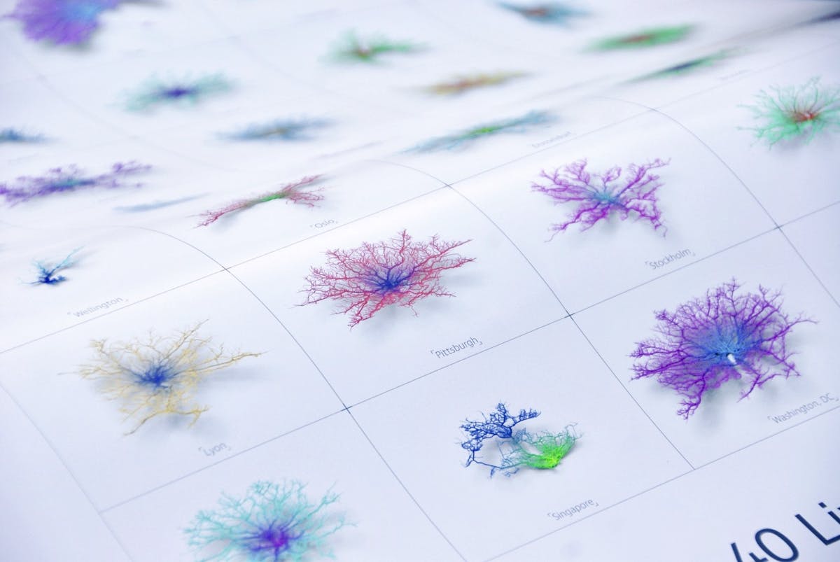
Everyone can relate to daily commutes. Whether it’s fifteen minutes or an hour, infrastructures in various cities dictate how transportation affects our daily lives. Through the use of data visualization, Craig Taylor, Data Visualization Design Manager at Ito World uses color and form to portray commute distances in an artistically beautiful way.
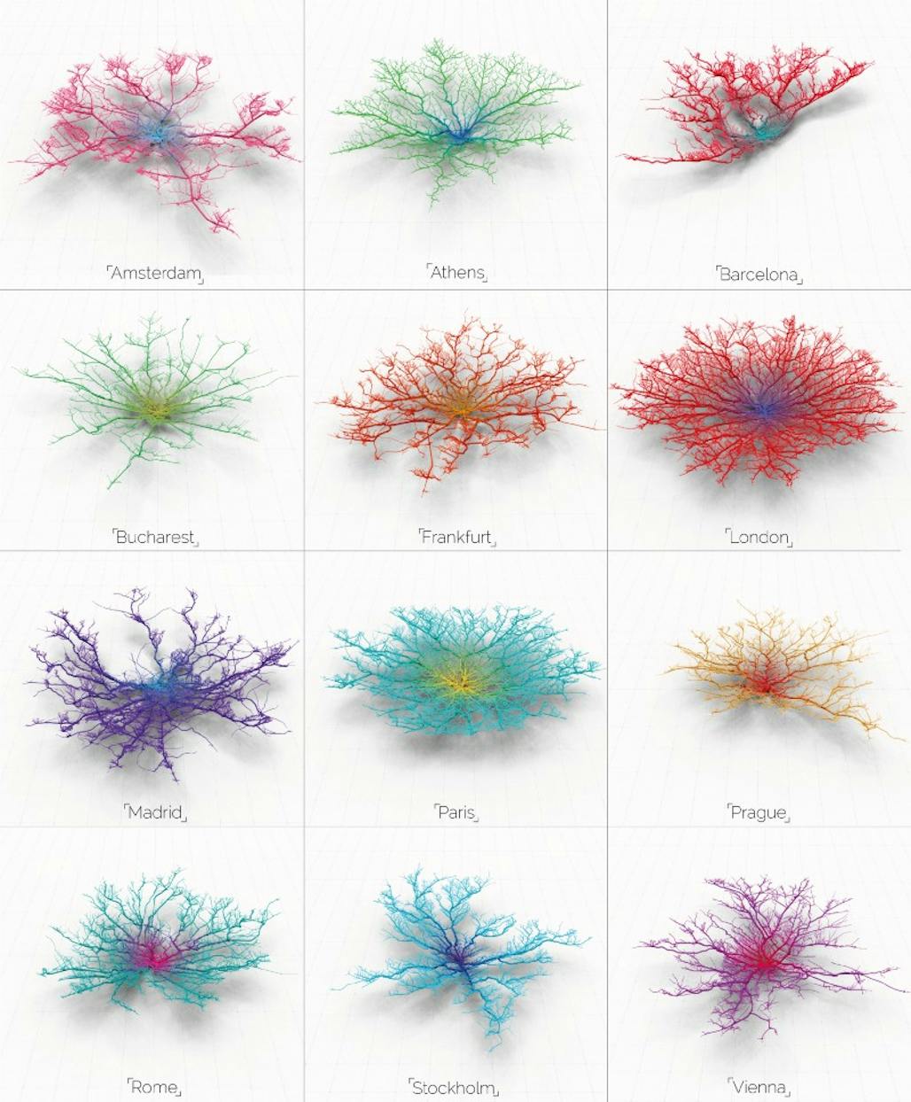
A project that depicts city infrastructure in a whole new light, Taylor blends art, urban planning, and science together to create beautifully rendered images of street networks in 40 major cities. The project appropriately called, Coral Cities, showcases how far one can travel by car 30 minutes from the center of major cities across the globe. Growing from the inside out, the visual depiction of city infrastructures resembles the form of growing coral.
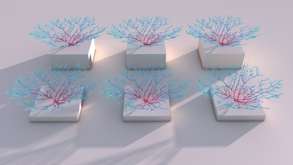
Depending on the geological features of the city, each “Coral City” is unique to its region. According…