The content below is taken from the original ( Start Me Up: What Has The Windows 95 Desktop Given Us 25 Years Later?), to continue reading please visit the site. Remember to respect the Author & Copyright.
We’ve had something of an anniversary of late, and it’s one that will no doubt elicit a variety of reactions from our community. It’s now 25 years ago that Windows 95 was launched, the operating system that gave the majority of 1990s PC users their first taste of a desktop-based GUI and a 32-bit operating system.
To the strains of the Rolling Stones’ Start me up, Microsoft execs including Bill Gates himself jubilantly danced on stage at the launch of what was probably to become the company’s defining product, perhaps oblivious to the line “You make a grown man cry” which maybe unwittingly strayed close to the user experience when faced with some of the software’s shortcomings.
Its security may seem laughable by the standards of today and the uneasy marriage of 16-bit DOS underpinning a 32-bit Windows operating system was clunky even in its heyday, but perhaps now is the best time to evaluate it unclouded by technical prejudice. What can we see of Windows 95 in the operating systems we use today, and thus from that can we ask the question: What did Windows 95 get right?
For Most People, This Was Where It All Started

Windows 95 was by no means the first operating system to use a desktop based GUI. While earlier Windows GUIs had been more akin to graphical launchers there had been a succession of other GUI-based computers since their Xerox PARC ancestor, so Macintosh and Amiga owners among others could have been forgiven for wondering why it took Redmond so long to catch up. But for all the clamour from the 68k-based fans, the indulgent smiles from X window users on UNIX workstations in industry and universities, and the as yet unfulfilled desktop fantasies of 1995’s hardy band of GNU/Linux users, the fact remains that for the majority of the world’s desktop computer users back then it would be the Microsoft Sound that heralded their first experience of a modern GUI operating system.
We’re lucky here in 2020, to have such computing power at our fingertips that we can run in-browser simulations or even outright emulations running real code of most of the 1990s desktops. WIndows 95 can be directly compared with its predecessor, and then with its contemporaries such as Macintosh System 7 and Amiga Workbench 3.1. Few people would have had the necessary four machines side-by-side to do this back then, so paging between tabs their differences and relative shortcomings become rapidly obvious. In particular the menu and windowing systems of the Mac and Amiga desktops which seemed so advanced when we had them in front of us start to feel cumbersome and long-winded in a way the Windows 95 interface for all its mid-90s Microsoft aesthetic, just doesn’t.
Using Amiga Workbench again after 25 years provides an instant reminder that an essential add-on to the Workbench disk back in the day was a little utility that gave window focus to mouse position, brought right-click menus up at the mouse pointer position, and brought focused windows to the front. Good GUIs don’t need to have their shortcomings fixed with a utility to stop them being annoying, they — to borrow a phrase from Apple themselves — just work. Right-click context menus at the mouse pointer position, the Start menu bringing access to everything into one place, and the taskbar providing an easy overview of multitasking, they were none of them earth-shattering, but together they set the Windows GUI as the one that became a natural environment for users.
Finding the Very Long Shadow of ’95 today

Returning to the present and Windows 10, the spiritual if not codebase descendant of Windows 95, has a Start menu and a task bar that will be visibly familiar to a user from 25 years before. They were so popular with users that when Windows 8 attempted to remove them there was something of a revolt, and Microsoft returned them to later versions. The same features appear in plenty of desktop environments in other operating systems including GNU/Linux distributions, indeed it can be found on my laptop running an up-to-date Linux Mint. Arguments will probably proceed at length whether it or the dock-style interface found on NeXT, MacOS, and plenty of other GNU/Linux distros are better, but this legacy of Windows 95 has proved popular enough that it is likely to remain with us for the forseeable future.
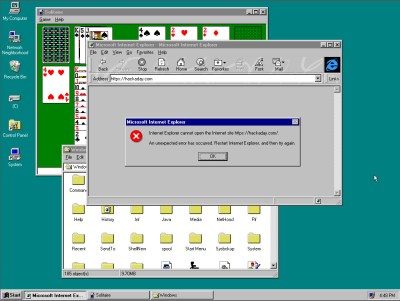
It’s odd, sitting down for this article at a Windows 95 desktop for the first time in over two decades. It’s so familiar that despite my having not possessed a Windows desktop for around a decade I could dive straight into it without the missteps that I had when revisting Amiga Workbench. It’s almost a shock then to realise that it’s now a retrocumputing platform, and there’s little in my day-to-day work that I could still do on a Windows 95 machine. Perhaps it’s best to put it down before I’m reminded about Blue Screens Of Death, about driver incompatibilities, or Plug and Pray, and instead look at its echoes in my modern desktop. Maybe it did get one or two things right after all.
Header image: Erkaha / CC BY-SA 4.0


